Brand Identity System
Brand Guide · 2026
01 · Logo System
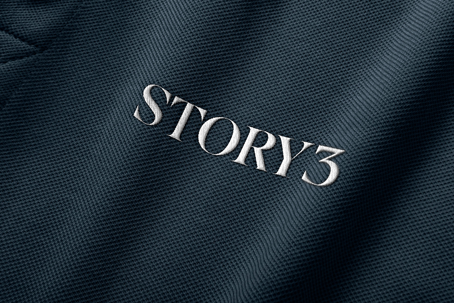
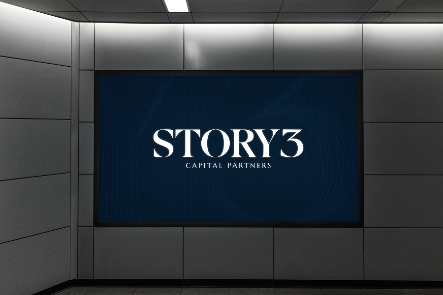
Primary Logo
The primary logo is the most recognizable expression of the STORY3 brand. Set in a high-contrast serif, it conveys authority, clarity, and long-term perspective. The "3" anchors the mark, representing progression across the distinct chapters of a company's growth and the belief that enduring value is built over time.
This logo should be used across all primary brand applications, including digital, print, and core marketing and business materials.
 On Navy
On White
On Navy
On White
02 · Logo System
Inline Logo
The inline logo is a secondary expression of STORY3. Its layered, multi-line serif construction conveys depth, precision, and the compounding nature of capital. Each stroke reflects the layers of value built over time, bringing a sense of structure and discipline to the mark.
This logo is a supporting element and should only be used alongside the primary logo, not as a replacement.
On Navy
On White
03 · Logo System
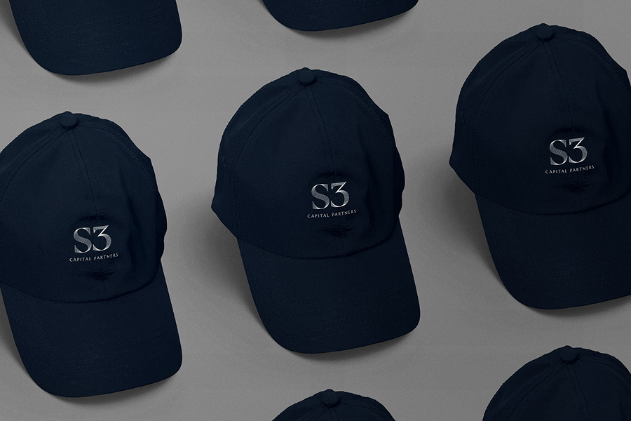
Initials Logo
The initials logo is a simplified monogram designed for flexible use across a wide range of applications, especially for smaller and tertiary applications. It maintains the integrity of the STORY3 mark while providing a clear, recognizable presence in formats where the primary logo may not be practical or necessary.
This mark may be used across both formal and informal touchpoints, including business materials, digital environments, social platforms, video, and branded backgrounds. It should not replace the primary logo in core brand communications.
 On Navy
On White
On Navy
On White
04 · Logo System
Alternate Initials Logo
The alternate initials logo is a simplified variation of the monogram, removing "Capital Partners" to allow for maximum clarity at very small sizes. It maintains recognizability while ensuring legibility in highly constrained formats.
This mark may be used for small-scale and detail-driven applications such as promotional items, accessories, and compact digital placements. It should not replace the primary logo in core brand communications.
On Navy
On White
05 · Logo System
Book Monogram
The book monogram is a specialized expression of the STORY3 mark, incorporating a book motif that reinforces the brand's commitment to knowledge, research, and long-term value creation. It is intended for select applications where a more distinctive or illustrative mark is appropriate.
This mark should be used sparingly and in contexts that benefit from its additional symbolism. It should not replace the primary logo or standard monogram in core brand communications.
 On Navy
 On White
06 · Logo System
Logo Don'ts
These guidelines ensure the integrity and consistency of the STORY3 brand across all applications. Improper use of the logo may weaken its clarity, impact, and recognizability. These rules apply to all STORY3 logo variations.
07 · Color
Color Palette
Click any swatch to copy the hex value.
Primary
Primary colors form the foundation of the STORY3 visual system. They should be used across all core elements, including body copy, titles, page backgrounds, interactive elements, and system-level components such as tooltips and alerts.
Navy
#031527
White
#FFFFFF
Black
#000000
Estoril Blue
#3895D0
Secondary
Secondary colors act as accents to support the primary palette. Use them selectively for buttons, text links, iconography, and captions. They should not be used for backgrounds or large-scale design elements. Orange Red is reserved for Portfolio popups and select footer accents. Use very sparingly.
Dark Navy
#04101D
Orange Red
#E24E21
Gold
#EEC354
Gray
#888888
Light Gray
#C0CFD0
Cool Gray
#E2EBF0
08 · Color
Color Don'ts
These guardrails protect the clarity and consistency of the STORY3 color system. All applications should adhere to these guidelines to maintain visual integrity.
09 · Typography
Typography
Together, this pairing reflects the firm's positioning. The depth and credibility of an established institution are expressed through the clarity of a genuine collaborator. It also creates a natural typographic hierarchy, guiding the reader from narrative context to precise, actionable detail.
Download Font Files (ZIP)Newsreader
Light · Regular · Italic
H-class · Body copy · CaptionsNewsreader, a contemporary serif designed for extended on-screen reading, brings editorial authority to STORY3's brand voice. Its high contrast strokes and classical proportions signal the seasoned judgment that defines a firm built on decades of investing experience.
Figtree
Regular · All Caps
Eyebrow subheaders · Minor messagingFigtree, a clean geometric sans-serif, provides the counterbalance: modern, legible, and approachable, it reflects STORY3's commitment to transparent partnership and straightforward communication with founders and management teams.
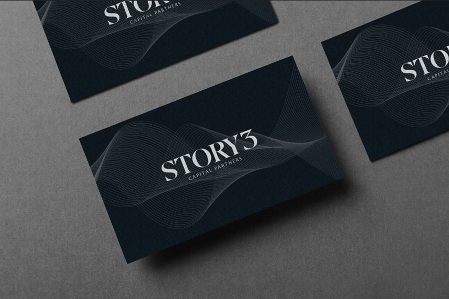
10 · Pattern
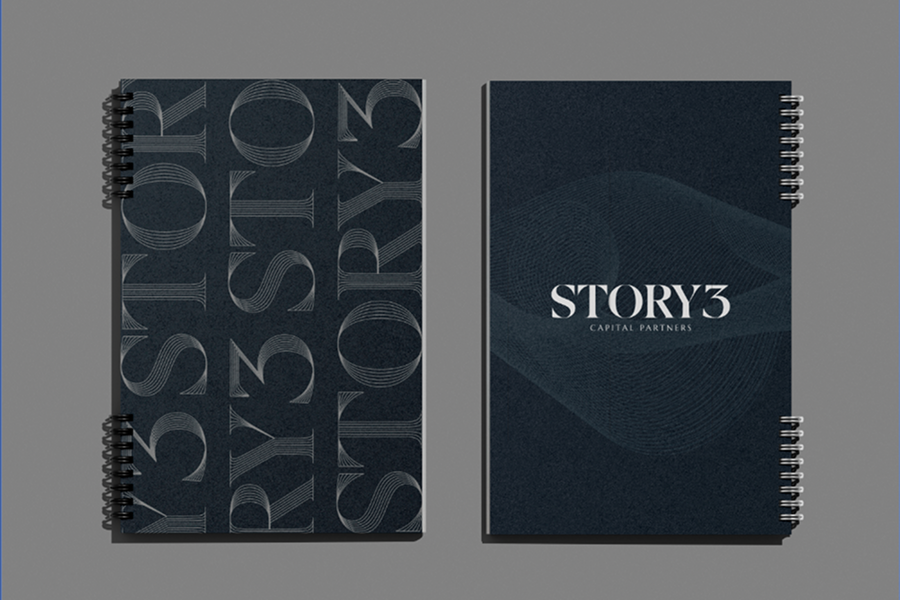
Wave Pattern
The wave illustration is a core visual element of the STORY3 brand. It functions as both a structural layout device and a subtle expression of the fluid, cyclical nature of capital markets and long-term investment.


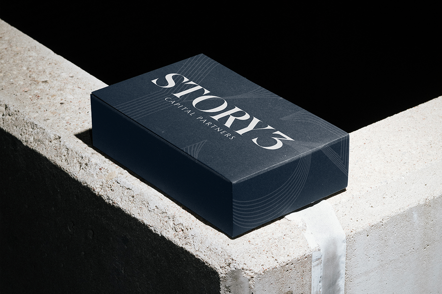
11 · Illustrative Applications
Illustrative Applications
Brand applications extend across both physical and digital touchpoints. The STORY3 identity is designed to carry authority across every format, from apparel to signage to branded swag items.